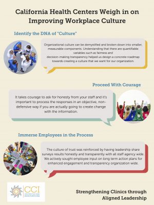
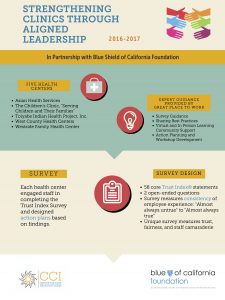
Several weeks ago I started brainstorming ways to illustrate the final results from our Strengthening Clinics through Aligned Leadership (SCAL) program.
This program brought together five clinics from across the state and helped them implement employee satisfaction surveys in order to best understand workplace culture and the role that leadership can play in improving office dynamics. As I sifted through the various write-ups and evaluations distilling clinic feedback, it became clear to me that I needed a visual that was accessible, “bite-sized,” and reflect the deeper importance of understanding the needs of staff.
From the get-go, I knew I didn’t want to create yet another slide deck or uninspired presentation that paraphrased the final reports from SCAL. I recalled my undergraduate professors hammering the point that the best writing shows, not tells, a story. Knowing that I wanted to do things a little differently, I came up with the idea of a “one-pager poster” (which actually ended up being two pages) to really compact and convey the enormous influence of this program on participating clinics.
Using Canva (a super-amazing FREE online graphic design suite), I designed one page that conveys a high-level view on the need-to-know elements of the program (i.e. our partnership with Blue Shield of California Foundation), and another page that portrays the top three takeaways of the SCAL program.
My hope is that this infographic demystifies the world of employee surveys and highlights how they can transform the way we think about workplace culture.
What do you think?
Find this useful or interesting? We’re constantly sharing stuff like this. Sign up to receive our newsletter to stay in the loop.