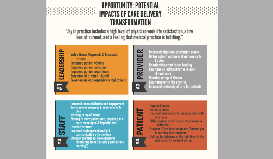
Recently my colleague Juliane sent over some great articles related to transforming care delivery and bringing the joy back into practice. Using online software called Piktochart, I created an infographic pulling out key content from these articles and tying in information about CCI’s CP3 technical assistance program.
Here is a clip of the infographic, but you can download the full infographic below.
When people ask me why I’m a vegetarian, I often respond by saying it makes life easier. I only need to look at one section of the menu, and I only need to visit certain aisles in the grocery store. That’s not the reason why I made this change 16 years ago, but in a city where I can get anything in the world delivered, sometimes having limited options is a relief.
Unfortunately, when it comes to other decisions, such sorting through the ideas and information we receive each day in our professional lives, being vegetarian isn’t an option. With so many resources and articles and best practices bombarding us through email and social media, how can you expect staff at your organizations to shift through it all to understand complex changes like payment reform? Sometimes one simple depiction can help us understand what dozens of white papers leave confused.
Why an infographic? It’s tough work communicating big, adaptive changes and getting folks onboard, especially when those changes impact how people perceive their professional roles or how they carry out job-related tasks. Before joining CCI, I spent five years providing outreach to health centers across the country and enabling services training and technical assistance. Throughout that time, the passage of the Affordable Care Act and ensuing changes took the center stage. Months leading up to the first round of open enrollment, people everywhere I went were panicked and anxious.
Who could blame them? A fundamental, complex shift was coming their way, and they were consumed with trying to understand how it impacted their work, and the patients and communities they served. Throughout that time, I grasped on to any simple, easy tool to help people absorb and feel comfortable with change. Since starting at CCI and working on our CP3 program, I’ve also been looking for tools to help explain payment reform and care delivery transformation.
The articles my infographic is based on were only 10 or 12 pages, but I still found it difficult to carve out time to read them. Once I did, I saw that there were insights there that would be valuable to clinics. We decided to figure out a way to share the content in a less time-consuming, more digestible format.
I don’t have a design background, but I was excited to discover that making this infographic was pretty straightforward. There are many different online software options like Piktochart that offer either free or highly discounted accounts to nonprofit organizations, with plenty of templates and how-to-guides that make creating infographics fun and quick.
Feel free to check out this resource, share it with your colleagues, and if you have thoughts about how to improve it—please let me know. Or if you have any similar tools or resources you’ve used to explain payment reform or other big changes, send them my way! I hope this infographic helps distill information about this big (and exciting!) change on the horizon.